Overview of PCA and PCoA
Principal Component Analysis (PCA) and Principal Coordinate Analysis (PCoA) are two of the main mathematical procedures or ordination techniques used for multivariate analysis. Unlike classification, which assigns names or labels, ordination is the arranging of samples or data along gradients. These approaches basically sacrifice a small amount of accuracy to produce a simplified visualization of a huge amount of microbiome gene expression data, for example.
Techniques such as PCA, PCoA, Non-Metric Multidimensional Scaling (NMDS), Redundancy Analysis (RDA), and Canonical Correspondence Analysis (CCA) all belong to the class of dimension reduction and data ordination methods. The need for dimension reduction arises due to the extensive dimensionality inherent in microbiome samples, where hundreds of microbial species may be present. To evaluate the similarity between these samples, it is necessary to conduct pairwise comparisons for every species, treating each species as a single distinct dimension. Therefore, we employ dimension reduction techniques to arrange the target data within a lower-dimensional space. This subsequent arrangement aims to maximize the proximity of similar targets while distancing those that are dissimilar, thereby facilitating downstream statistical analysis.
What Is Principal Component Analysis (PCA)
PCA serves as a method to reduce large datasets into smaller components while maintaining a significant proportion of the original information. It achieves this by decreasing the quantity of variables included in the dataset, ensuring that only highly correlated variables are clustered together. Visualization of datasets possessing one to three variables is feasible within one to three dimensions. However, the complexity of the analysis escalates markedly once the number of variables exceeds three, reaching an impractical status when visualizing datasets across 200-plus dimensions. To overcome such complications, researchers employ multivariate analysis methods, including PCA, to simplify the visualization and analysis by eliminating irrelevant variables. The ultimate result is a low-dimensional graphical representation of the data, where inter-point distances in the plot closely mirror those in the original differential spread.
PCA Procedures
The procedure involves standardization which eliminates bias by altering the range of continuous primary variables to the same scale so that each one contributes equally to the analysis. Then, the covariance matrix computation is done to examine any existing relationships through their varying values from the mean with respect to each other. Correlation is observed when the covariances have a positive sign; otherwise, they are inversely correlated. Eigenvectors and eigenvalues were then computed from the covariance matrix to identify principal components which are new variables that are generated as linear combinations.
These are combinations of uncorrelated variables and most information within the primary variables is compressed into the first principal component. Basically, 50-dimensional data, which normally gives you 50 dimensions, could be squeezed into the first component (PC1) and into the second principal component (PC2) while retaining maximum possible information. PC1 has the largest possible variance or where the values are scattered the most. PC2, on the other hand, contains the next highest variance. Next, a feature vector is generated by choosing components that have the highest significance. Lastly, data is reoriented to the ones represented by the principal components by using the eigenvectors.
PCA can be useful for integration in microbiome sequencing data because it provides a visualization of correlations between samples and it also relates features within and across multiple tables. However, some tables may have more variables than others; hence, dominating the resulting ordination. Another drawback of PCA is that it can only relate pairs of variables and not between sets of variables defining the tables. CCA and MFA can address these drawbacks.
PCA Graph Interpretation
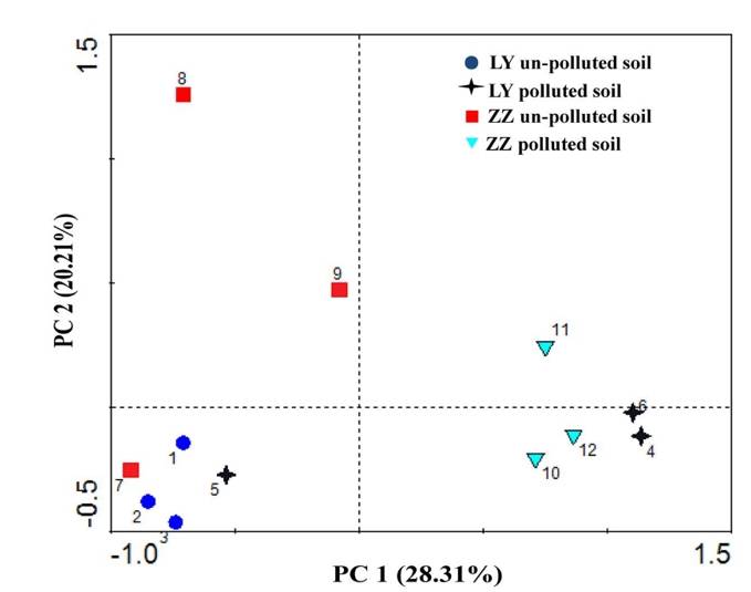 PCA analysis plot example. (Xie et al., 2016)
- Key Analysis Focus: Operational taxonomic unit (OTU) analysis in microbial community research.
- Input Data: The OTU abundance table of samples.
- Graph Type: Scatter plot.
- Graph Interpretation: Each point on the graph represents a sample, with various colours and shapes signifying the grouping information of the samples. The distance between samples within the same group details the strength of replication. Conversely, the varying proximities among different group samples reflect inter-group community differences. Samples from different environments typically exhibit separate clustering phenomena.
- Axis Interpretation: The horizontal and vertical axis in the graph represent the first and second principal components respectively. PCA reduces high-dimensional OTU information of samples to a two-dimensional plane that uses the first and second principal components as its axes. The percentage indicated on each axis denotes the contribution of the principal component to the differential expression in OTU data of samples, typically the horizontal (x-axis) percentage is higher than the vertical's (y-axis).
What Is Principal Coordinate Analysis (PCoA)
Principal Coordinates Analysis (PCoA) is a technique that maps the relative similarities or differences between samples onto a two-dimensional plane for visualization. Essentially, it projects the distances amongst samples onto a set of coordinate axes, selecting the first two axes that best preserve the original distribution of distances for data representation. The outcome of a PCoA is contingent on the method used to calculate sample similarity or distance. Thus, the choice of distance metric can have a substantial effect on the results of the PCoA. Common metrics used include Bray-Curtis, Weighted Unifrac, and Unweighted Unifrac distances, with the selection of principal coordinate combinations being displayed graphically based on their contribution rates. Closely related samples, indicative of similar species composition, tend to cluster together, while those with high community variation would spread far from each other on the biplot.
PCoA Procedures
The process encompassed by Principal Coordinates Analysis (PCoA) comprises several computational steps, including generation of a distance matrix, its centralization, eigenvalue decomposition, selection of principal coordinates, and the calculation of sample projections on these principal coordinates.The distance matrix, a reflection of relative dissimilarities amongst the analyzed samples, is derived from the sample data itself. This matrix can leverage different distance metrics contingent on the empirical requirements of specific scenarios. For instance, possible distance measures include Euclidean Distance, Manhattan Distance, Bray-Curtis Distance, among others. Further, to yield a doubly-centered condition, the generated distance matrix undergoes a centralization procedure. This process refines the data structure, making it more amenable to downstream statistical interrogation and interpretation.
The distance matrix, following centralization, undergoes eigendecomposition, leading to the extraction of eigenvalues and their corresponding eigenvectors. By employing eigendecomposition, we can acquire the coordinates of samples in the principal coordinate space, establishing their relative position to one another. The number of principal coordinates is purportedly decided according to the magnitude of eigenvalues. In most cases, we select the eigenvectors, whose corresponding eigenvalues are the largest, to serve as the principal coordinates. Subsequently, projecting the original data onto these selected principal coordinates allows for the computation of each sample's coordinates within this space. Such values provide a representation of each sample's location within the principal coordinate space. Ultimately, the result of PCoA can be presented as the coordinates of samples within the principal coordinate space, visualizing through means such as a scatterplot.
PCoA Graph Interpretation
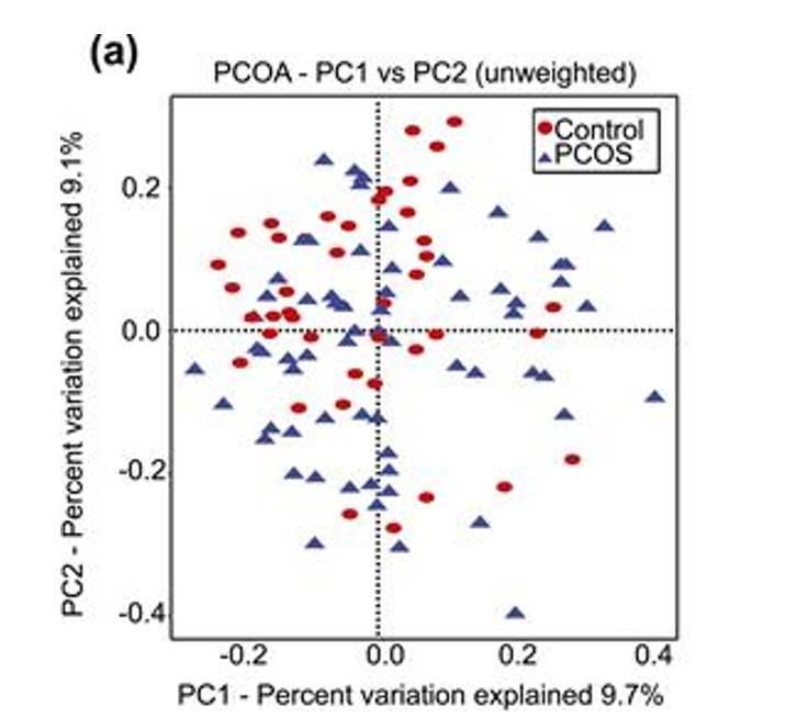 PCoA analysis plot example. (Torres et al., 2018)
- Key Analysis Focus: β-analysis in microbiome studies.
- Input Data: Similarity distance matrix of samples.
- Type of Graph: Scatter plot.
- Interpretation of the Graph: The points in the graph represent samples, with different colors/shapes indicating the grouping information of the samples. The distance between points of the same group reflects the strength of repeatability of samples, while the distance between points of different groups reflects the differences in sample distances between groups, with samples showing stronger heterogeneity being further apart. The method of calculating sample similarity distance has an impact on the results. Choosing different input similarity distance matrices will lead to varying degrees of differences in the results.
- Meaning of the Axes: The horizontal and vertical axes in the graph represent the first and second principal coordinates, respectively. PCoA analysis reduces the dimensionality of the input similarity distance matrix and maps it to a two-dimensional plane formed by two principal coordinates. The percentages labeled on the axes represent the contribution of the principal coordinates to the variation in the sample matrix data. Typically, the percentage on the horizontal axis is higher than that on the vertical axis.
Difference Between PCA and PCoA
The PCoA analysis employs the concept of dimensionality reduction to project sample relationships onto a low-dimensional plane. However, unlike PCA analysis which directly projects the species abundance data of samples, PCoA projects sample data obtained through different distance algorithms to obtain a sample distance matrix, where the distances between sample points in the plot correspond to the dissimilarity distances in the distance matrix. Consequently, while PCA plots simultaneously reflect sample and species information in a biplot, PCoA plots represent a type of non-biplot that solely reduces the dimensionality of the sample distance matrix.
The PCA method is reliant on the species abundance matrix, implying that the matrix dimension analyzed using this method equates to the number of species. Similarly, the PCoA is based on the intersample distance matrix, suggesting that the matrix dimension analyzed using PCoA is associated with the sample size. Therefore, if the sample size is relatively large and the number of species is significantly smaller, PCA would be the sensible selection. Conversely, if the sample population is relatively small and the number of species substantially larger, PCoA becomes the more fitting choice. These decisions should be conditioned by the respective proportions of sample size to species abundance in your data set.
References
- Mohammadi, S.A. Prasanna, B.M. Review and Interpretation Analysis of Genetic Diversity in Crop Plants —Salient Statistical Tools. Crop Science, 2003, 43, 1235-1248.
- Sankaran, K., & Holmes, S. P. Multitable Methods for Microbiome Data Integration. Frontiers in genetics, 2019 10, 627.
- Xie Y, Fan J, Zhu W, et al. Effect of heavy metals pollution on soil microbial diversity and bermudagrass genetic variation. Frontiers in plant science, 2016, 7: 181248.
- Torres P J, Siakowska M, Banaszewska B, et al. Gut microbial diversity in women with polycystic ovary syndrome correlates with hyperandrogenism. The Journal of Clinical Endocrinology & Metabolism, 2018, 103(4): 1502-1511.