ROC Curve Analysis
CD Genomics provides customers with high-quality receiver operating characteristic curve (ROC curve) drawing services based on years of experience in data statistical analysis. Regardless of whether your research data is clinical data or basic research data, we will develop a suitable analysis plan for you.
Introduction
The receiver operating characteristic curve (ROC curve), also known as sensitivity curve, is a method of comparing diagnostic tests. As the receiver's sensitivity increases, the number of false positives will increase. Therefore, the ROC curve actually reflects the relationship between specificity and sensitivity. It is a graph of the relationship between the true positive rate and the false positive rate. The logic behind it is that if a test has no diagnostic capability, then it has the same probability of producing a true positive or a false positive. As the diagnostic ability increases, that is, the specificity increases, the true positive rate rises and the false positive rate decreases. In clinical diagnosis, ROC is generally used to evaluate the clinical accuracy of test items, such as evaluating the accuracy of multi-index joint inspection, and the detection of unknown single-index cut-off values. In addition, in biomarker research, ROC is a useful graphical tool for evaluating the predictive performance of a biomarker, indicating the ability of a biomarker group to distinguish between two groups (such as experimental group and control group, disease and health).
ROC Curve Application Fields
1. The ROC curve can easily find out the disease recognition ability at any limit value.
2. Choose the best diagnostic limit value.
3. Compare the ability of two or more different diagnostic tests to recognize diseases. When comparing two or more diagnostic methods for the same disease, the ROC curve of each test can be drawn to the same coordinate, which can visually distinguish the pros and cons. The ROC curve near the upper left corner represents the more accurate the test. It can also be compared by calculating the area under the ROC curve (AUC) of each test separately, which test has the largest AUC, and which test has the best diagnostic value.
ROC Curve Drawing Pipeline
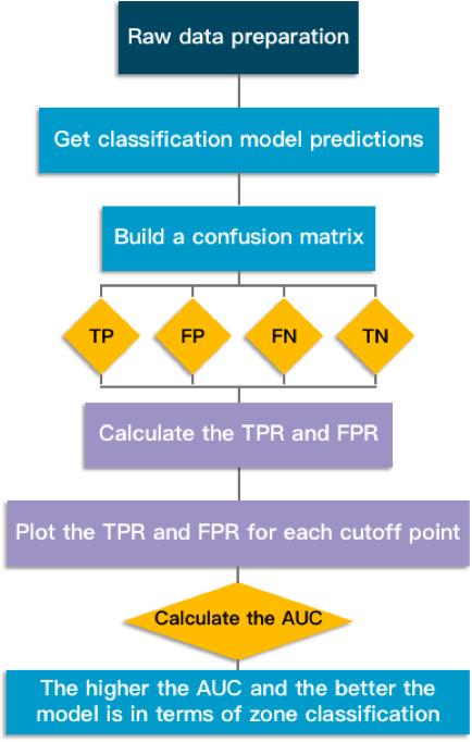 Fig1. ROC Curve Drawing Pipeline.
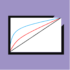
(1) The relationship between sensitivity and specificity, for example, when sensitivity decreases, specificity increases.
(2) Test accuracy: The closer the curve is to the top and left borders, the more accurate the test; and the closer the curve is to the diagonal, the lower the accuracy of the test.
(3) The likelihood ratio is given by the derivative at any particular tangent point.
ROC Curves
The ROC curve is a curve drawn with the true positive rate (sensitivity) as the ordinate and the false positive rate (1-specificity) as the abscissa. The independent variable (test item) is generally a continuous variable, and the dependent variable (gold standard) is generally a binary variable.
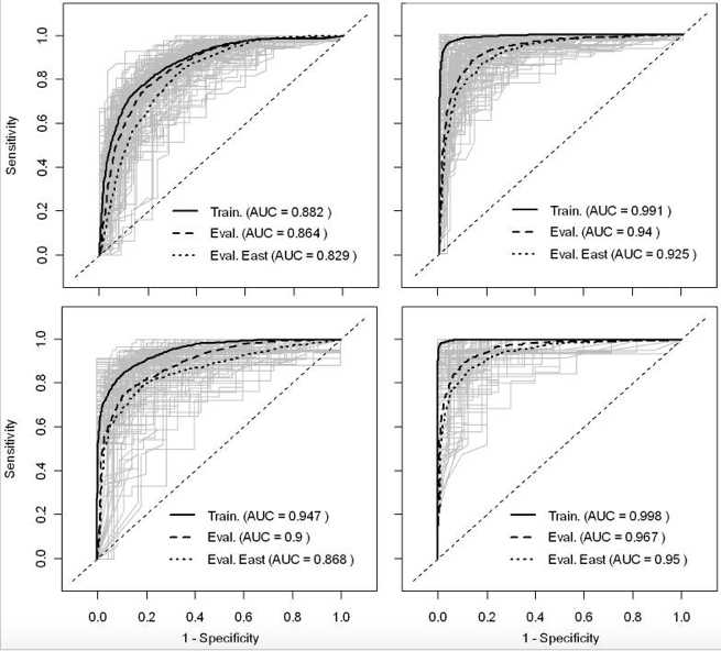 Fig 2. Receiver operator characteristic curves of the predicted risk of HPAI H5N1 presence/absence. (Martin V, et al.2011)
- Left and right plots are the ROC curves of the bootstrapped logistic regression models and BRT models, respectively.
- Top and bottom plots are the ROC curves of the models based on HPAI H5N1 clinical disease outbreak data, and HPAIV H5N1 risk-based surveillance data, respectively.
What We Offer
In order to fully cover the data analysis needs of clinicians or scientific researchers, CD Genomics provides one-stop services for drawing ROC curves. Customers only need to provide the original data and analysis requirements. We will select different analysis algorithms to draw the ROC curve according to the customers' different analysis purposes and original data, so as to obtain accurate analysis results. We rely on deep technical precipitation, efficient computing capabilities, safety standards, and strong data processing capabilities to provide customers with satisfactory data analysis services. For our data analysis services, if you have any questions, please feel free to contact our professional technical support. We are always ready to provide you with satisfactory services.
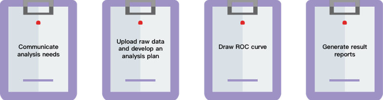
Our workflow
Reference
- Martin V, et al. Spatial Distribution and Risk Factors of Highly Pathogenic Avian Influenza (HPAI) H5N1 in China[J]. PLoS Pathogens, 2011, 7(3): e1001308.
* For research use only. Not for use in clinical diagnosis or treatment of humans or animals.
Online Inquiry
Please submit a detailed description of your project. Our industry-leading scientists will review the information provided as soon as possible. You can also send emails directly to for inquiries.